Basic Building Blocks
Research Project
More Info Coming Soon
Research Project
More Info Coming Soon
The starting point for Netto was the idea of developing a no-frills typeface with as little historical baggage as possible. The individual letters were reduced to their characteristic basic forms and stripped of all superfluous details. An extensive series of icons was designed to complement the typeface.
I'm a graphic designer, my main occupations are type design and teaching at HfG Schwäbisch Gmünd. Overall, I think colours are fine, but things get really interesting in black and white.
I especially like symbols, pictograms, icons and all the countless signs beyond plain text. I have mixed feelings about emoji, but you should check out OpenMoji ; )
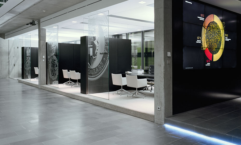
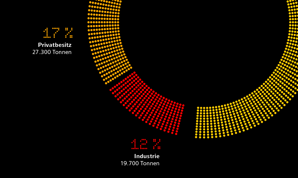
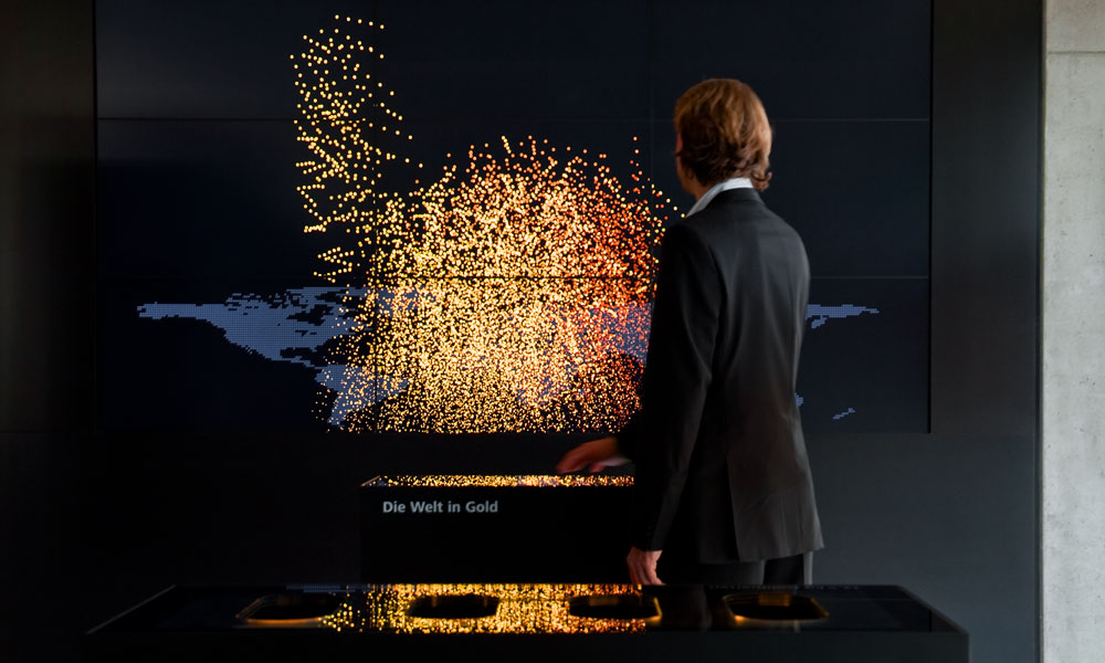
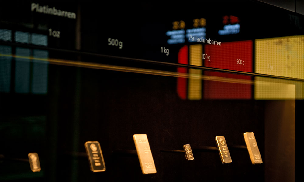
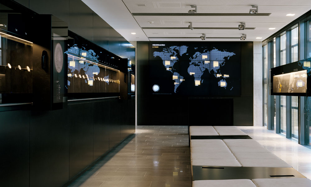
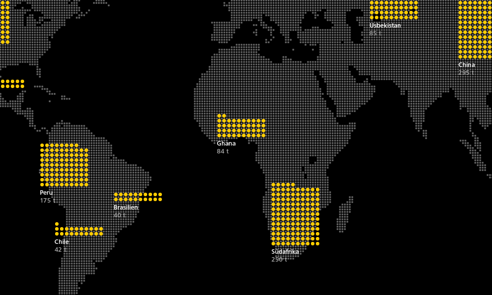
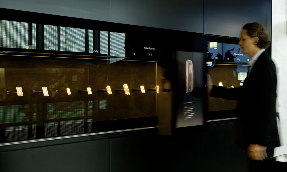
pro aurum is a private precious metals trading company. The exhibition in the foyer of its Munich headquarters offers customers an overview of the subject of gold. Charts and infographics build up fluidly as animations composed of finely rendered gold particles.
The goal in designing the icon system was to ensure clear recognizability within the corporate design: each icon had to be unmistakably perceived as part of AutoScout24. All icons share a similar level of complexity as well as consistent proportions, line weights, and spacing.
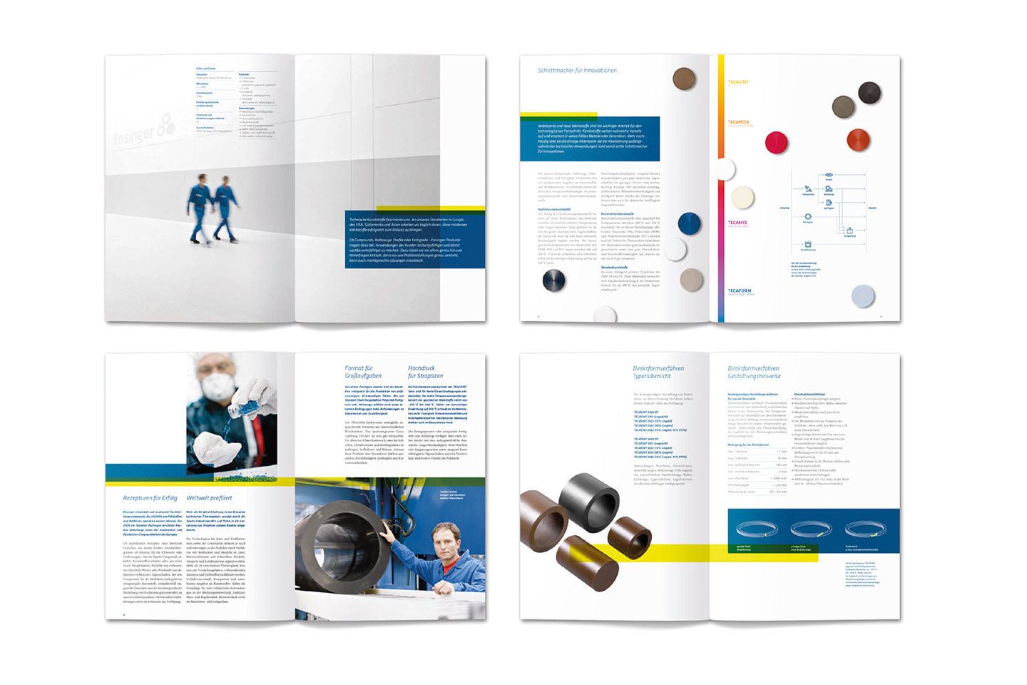
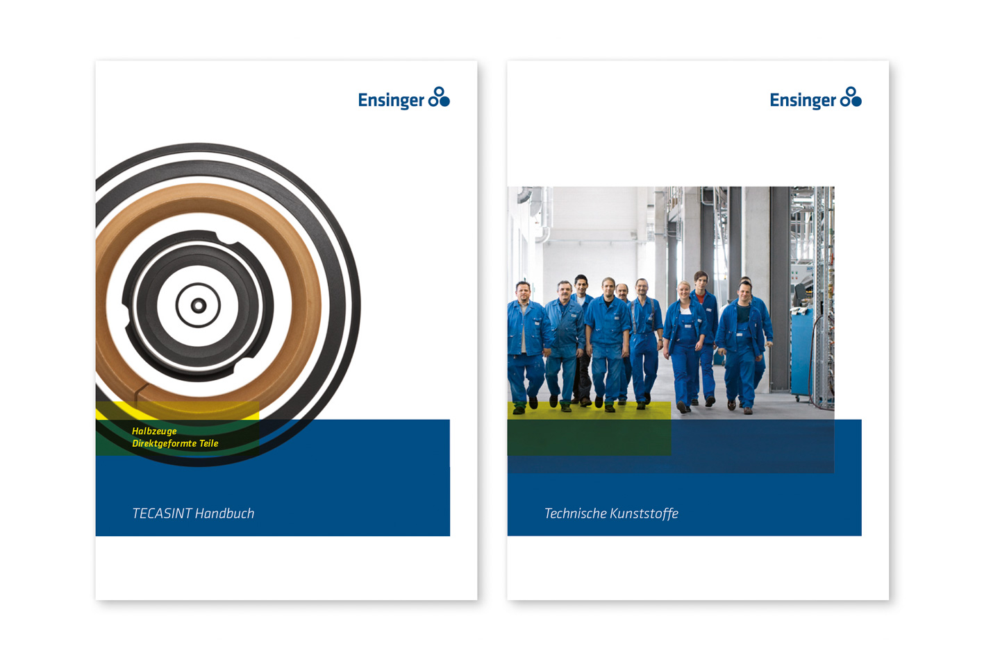
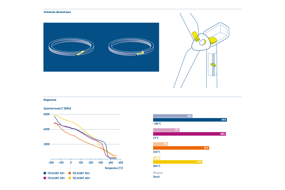
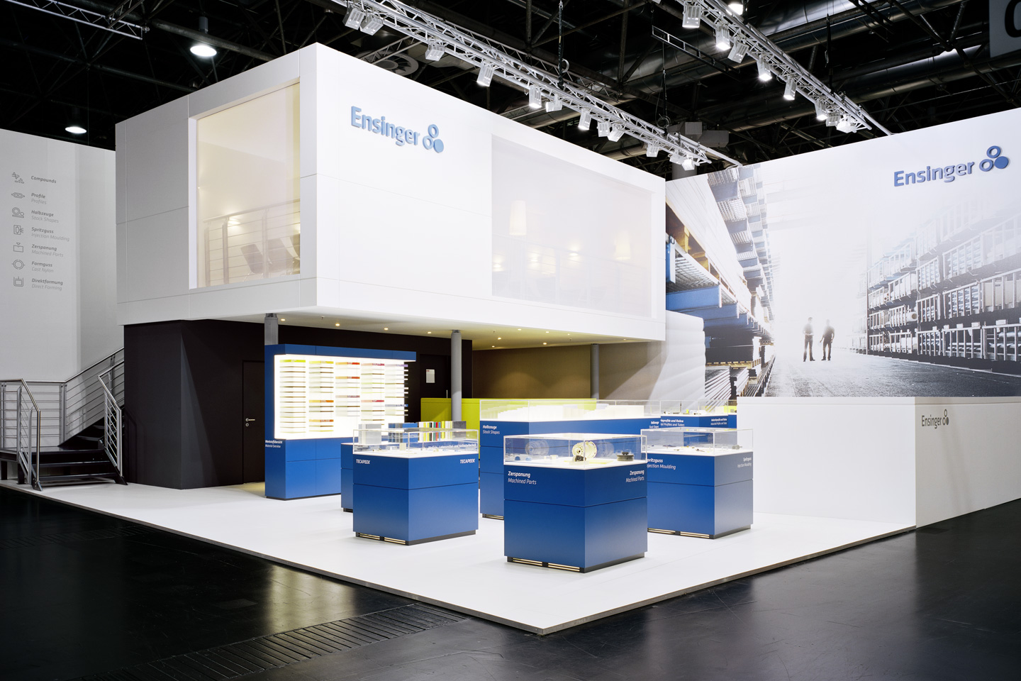
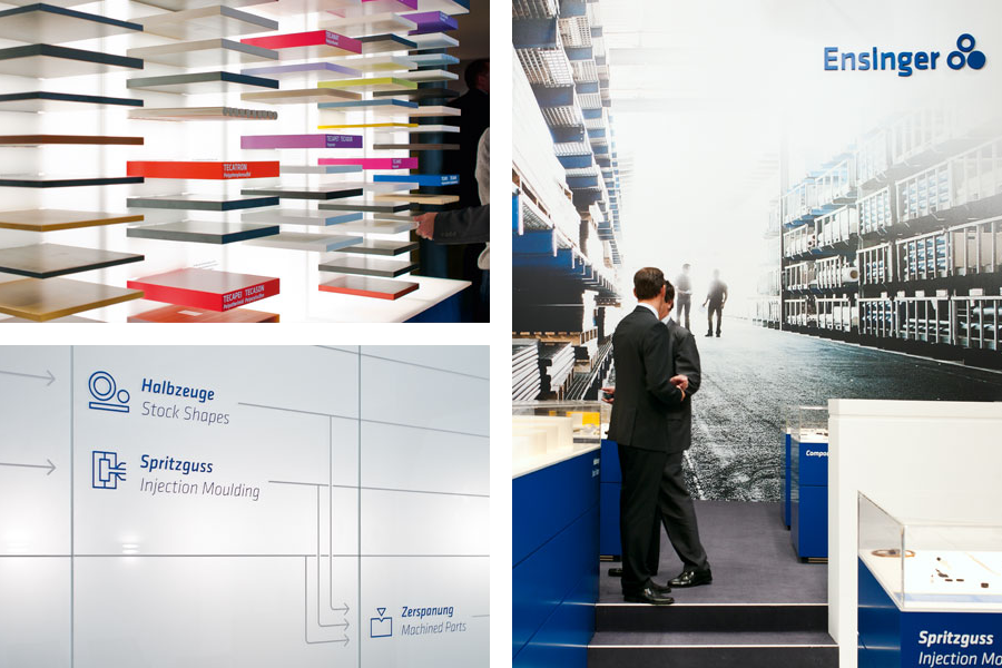
Icons and information graphics are used to provide a concise visual representation of the properties and application areas of various high-performance plastics. Applications include brochures, trade fair stands, and digital media.
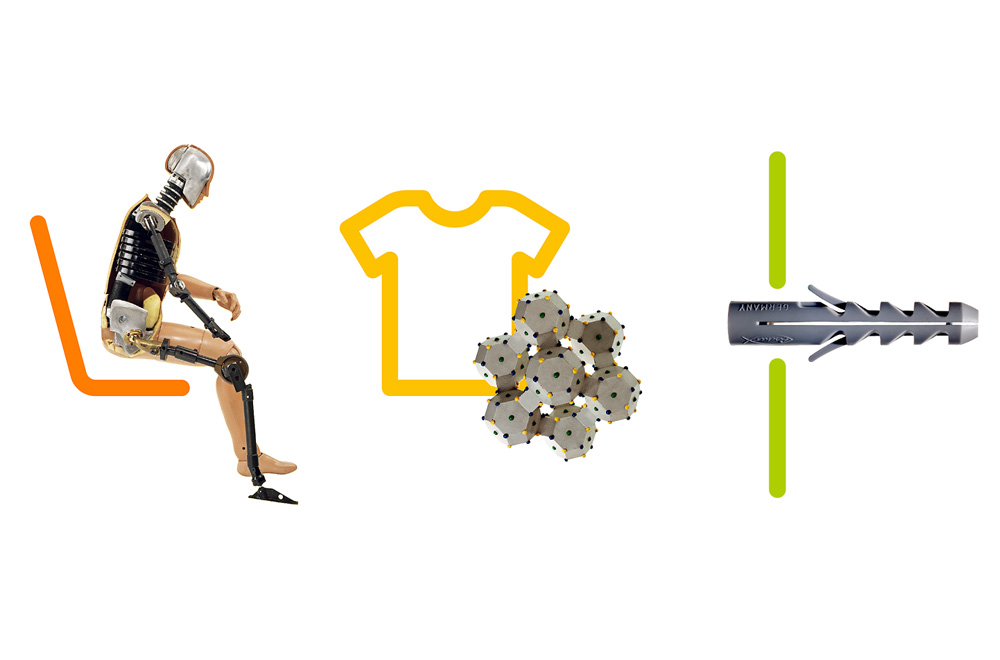
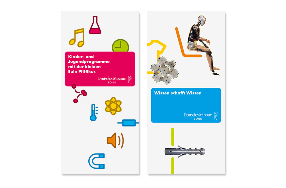
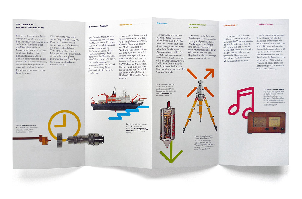
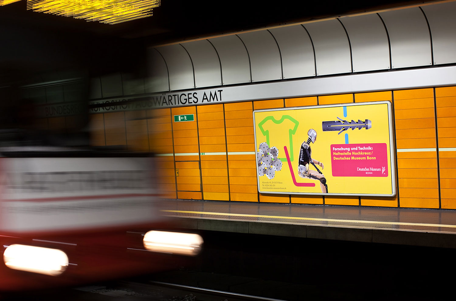
The pictograms provide context for the exhibits and illustrate their function. The crash test dummy settles into the driver's seat, the detergent molecule attaches itself to a T-shirt, and the wall plug disappears into the wall.

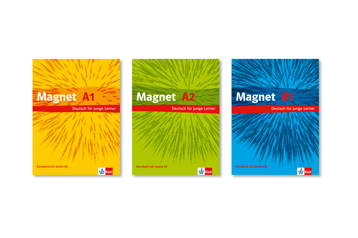
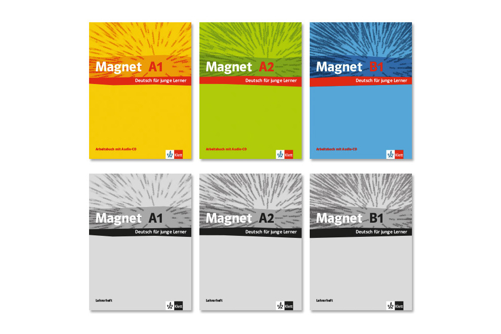
A purely typographic solution was developed for the "Magnet" series. The dynamic arrangement of terms within the "magnetic field" was generated using a custom-built program. As the level of difficulty increases, the magnet attracts an ever-growing number of terms.
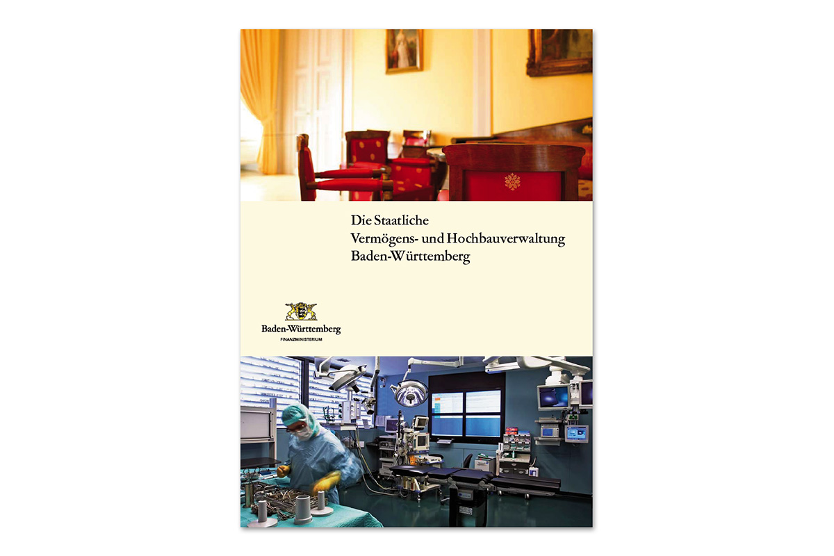
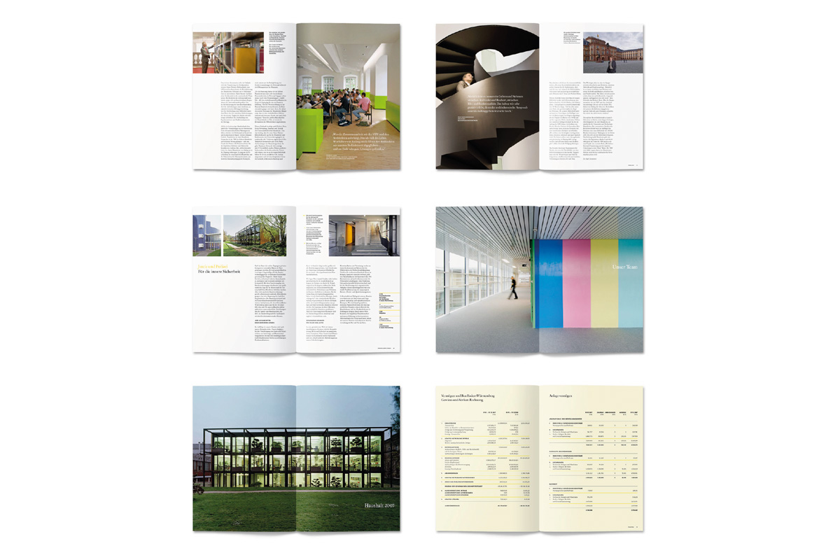
Annual Report
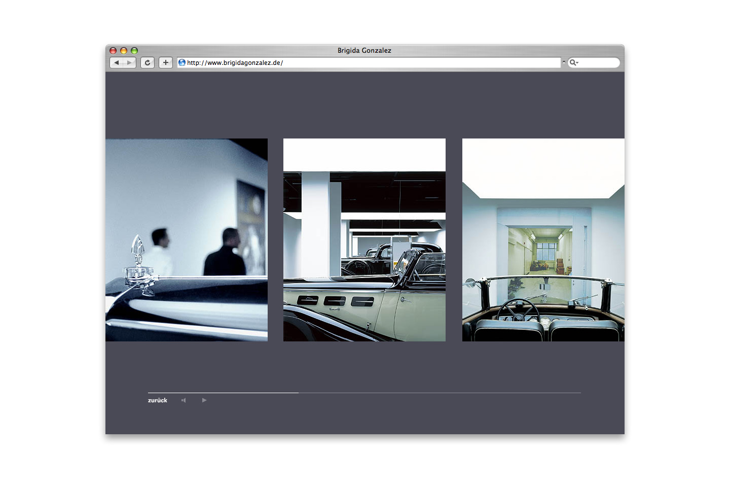
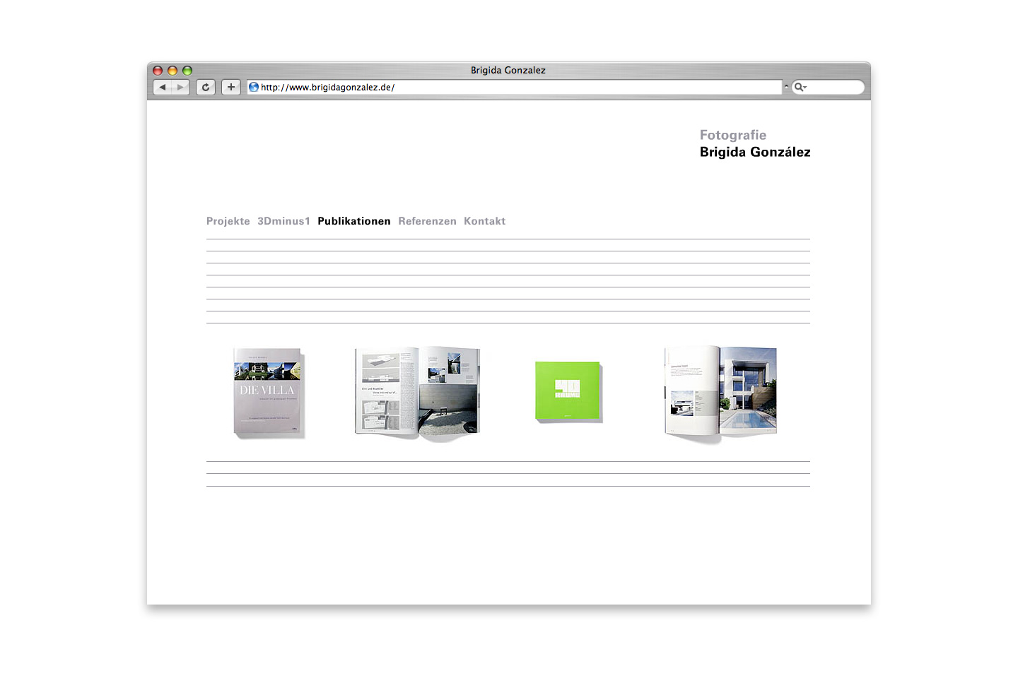
red dot design award 2007
iF communication design award Gold 2008
Logo, Wordmark
Wordmark
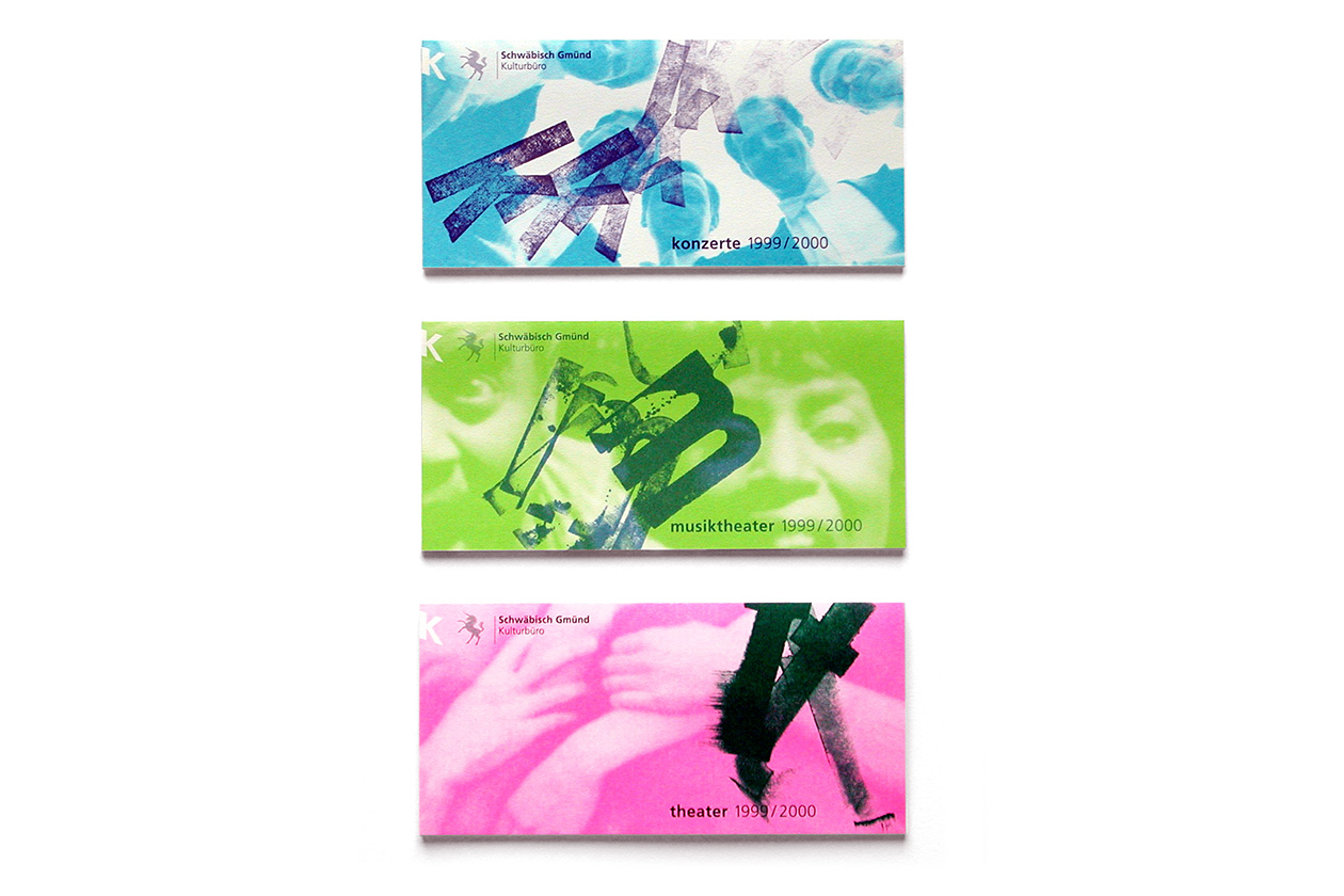
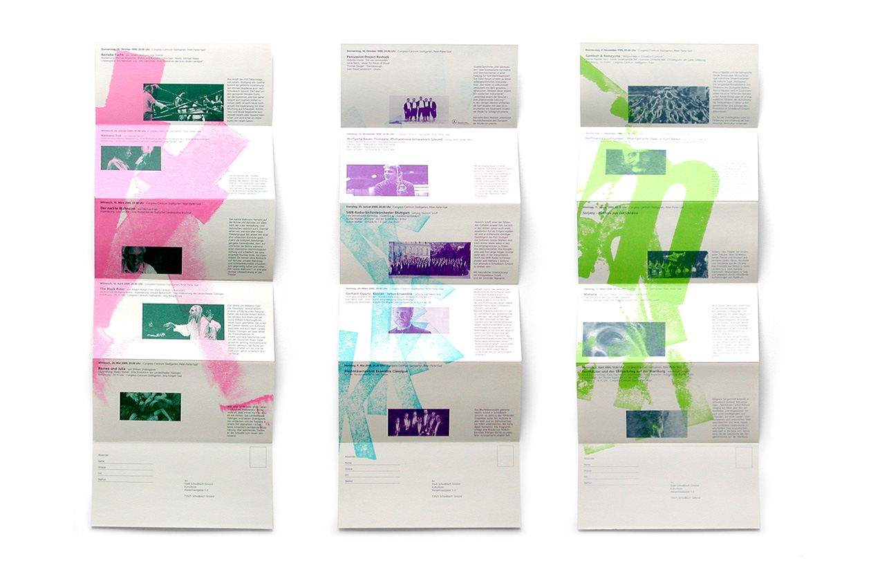
Program Leaflets
Angaben gemäß § 5 DDG
Daniel Utz
Luchsweg 7
73230 Kirchheim/Teck
Deutschland
Kontakt:
mail ät danielutz.de
Verantwortlich für den Inhalt nach § 18 Abs. 2 MStV:
Daniel Utz, Anschrift wie oben
Verantwortlicher: Daniel Utz
Beim Besuch dieser Website verarbeitet unser Hosting-Provider Host Europe automatisch technische Daten (u.a. IP-Adresse, Datum/Uhrzeit, Browsertyp) in Server-Log-Dateien. Grundlage: Art. 6 Abs. 1 lit. f DSGVO (berechtigtes Interesse an sicherem und stabilem Betrieb der Website).
Sie haben das Recht auf Auskunft, Berichtigung, Löschung, Einschränkung der Verarbeitung, Datenübertragbarkeit, Widerspruch sowie Beschwerde bei einer Aufsichtsbehörde.